Brand Elevation
SteelKings
Crafting a Distinct Visual Identity for Steelkings Artisan Fire Pits
Client: SteelKings
Services: Branding
Background
Steelkings Artisan Fire Pits needed a visual identity that would capture the essence of their brand—artisan craftsmanship, superior quality, and timeless elegance. Verso took a strategic and creative approach to developing a brand identity that reflects both innovation and heritage while ensuring strong market presence.
Approach
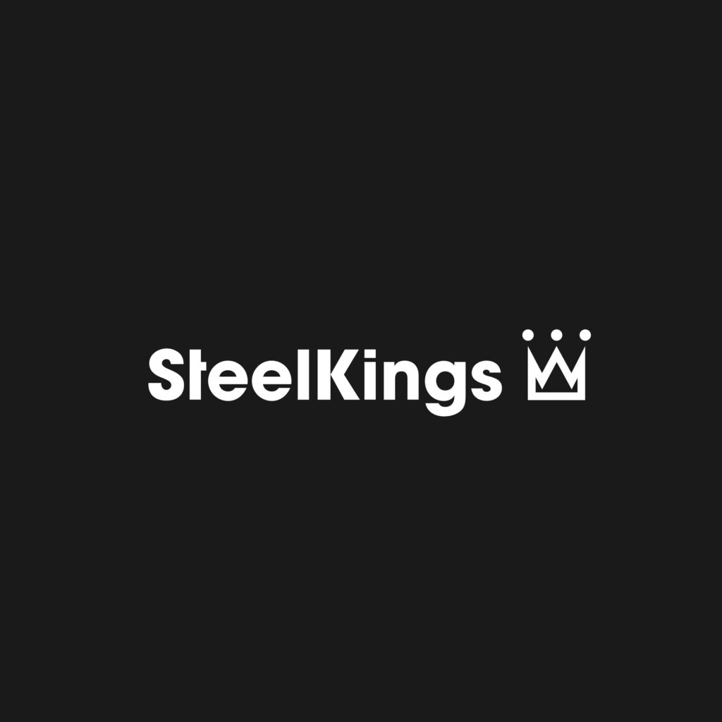
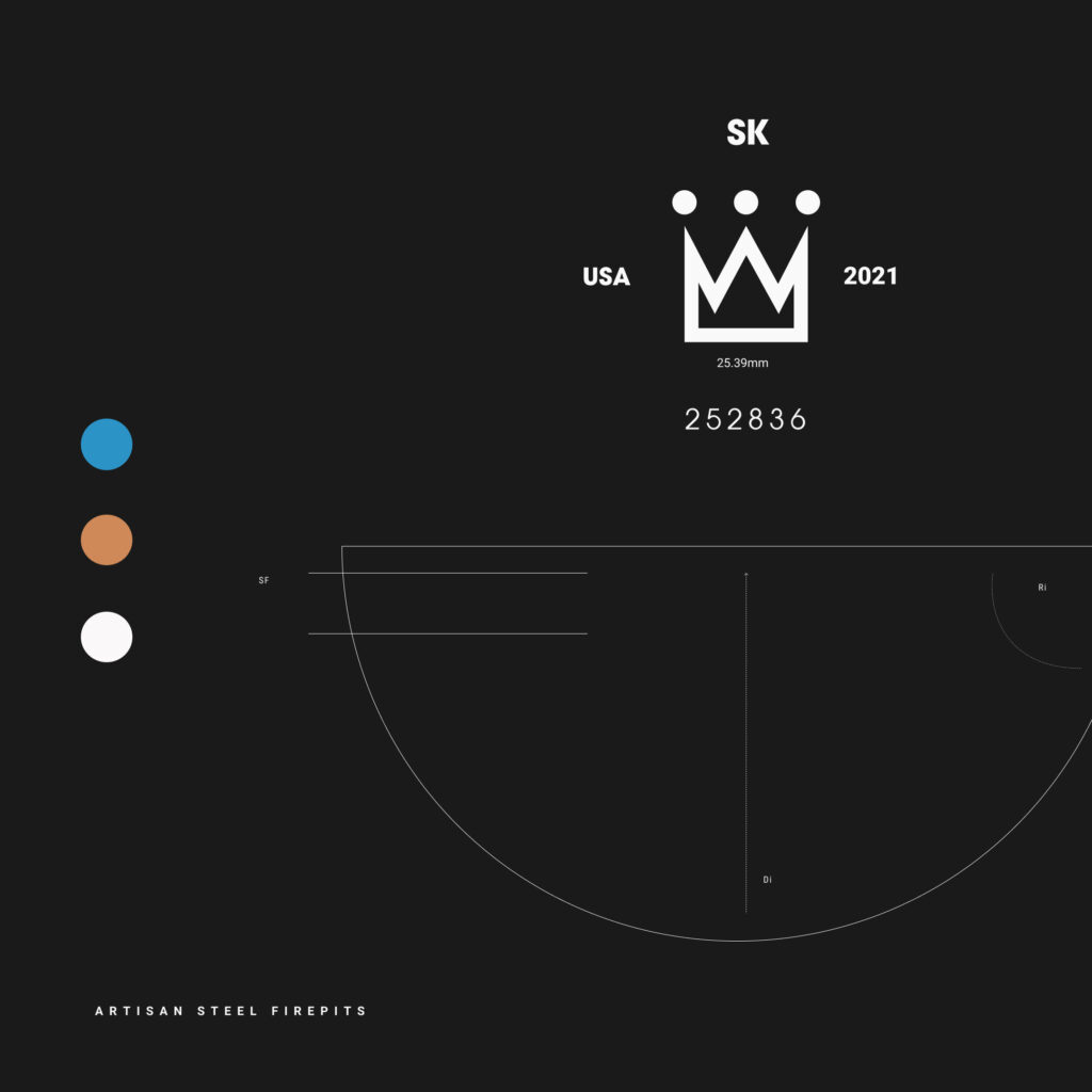
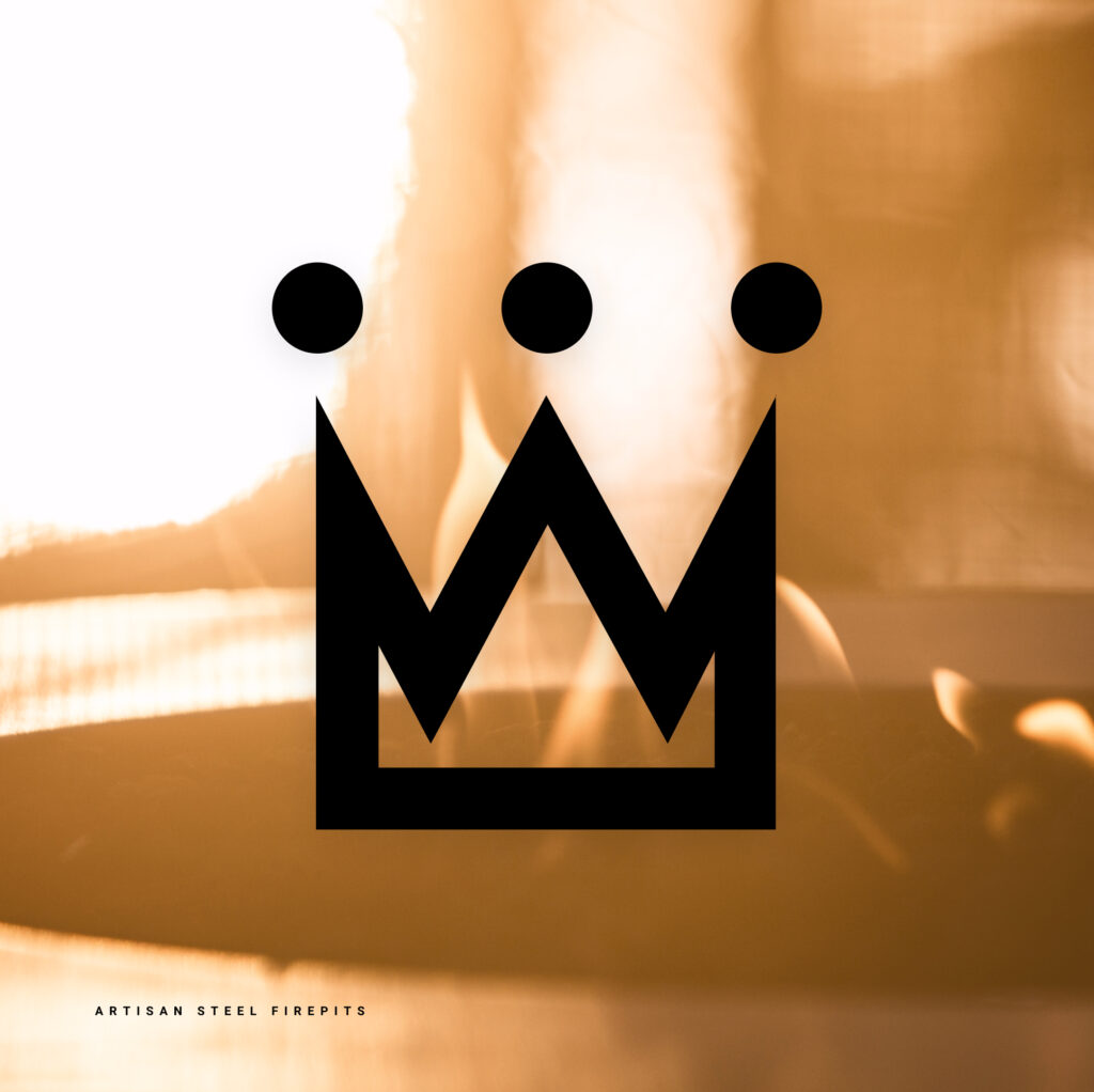
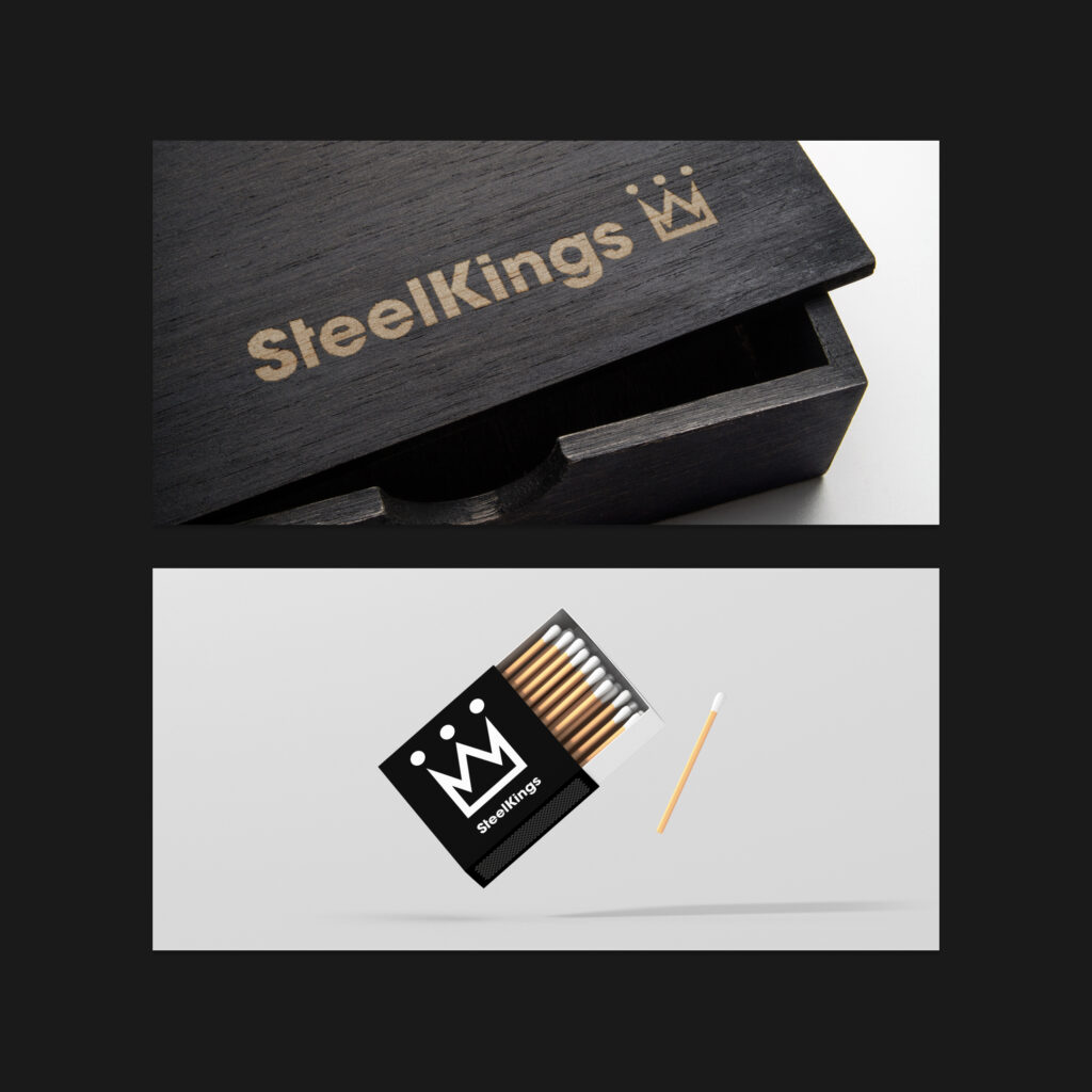
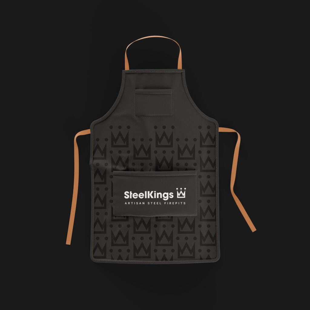
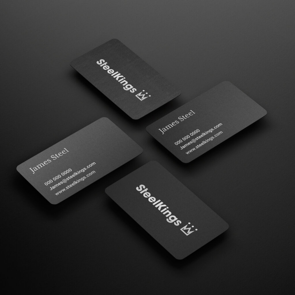
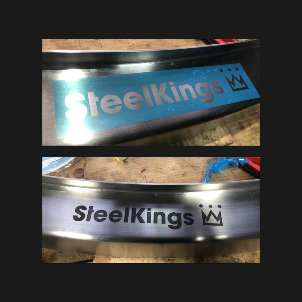
Our process began with a deep dive into Steelkings’ values, emphasizing craftsmanship and durability. We designed a logo that seamlessly blends modern sophistication with rustic tradition, featuring a stylized crown intertwined with robust steel imagery. This mark was crafted for versatility, allowing it to be stamped directly onto the fire pits as well as applied across marketing materials.
The color palette was carefully chosen to reflect the brand’s core values—deep charcoal symbolizes strength and durability, muted orange conveys warmth, and cobalt highlights craftsmanship. To ensure consistency, we created comprehensive brand guidelines detailing logo usage, typography, and color applications.
Results & Impact
The new identity not only distinguishes Steelkings Artisan Fire Pits in a competitive market but also resonates deeply with customers who appreciate both aesthetic beauty and functional durability. With a cohesive and thoughtfully crafted brand presence, Steelkings now stands as a premium name in artisan fire pits, embodying the perfect balance of strength and sophistication.
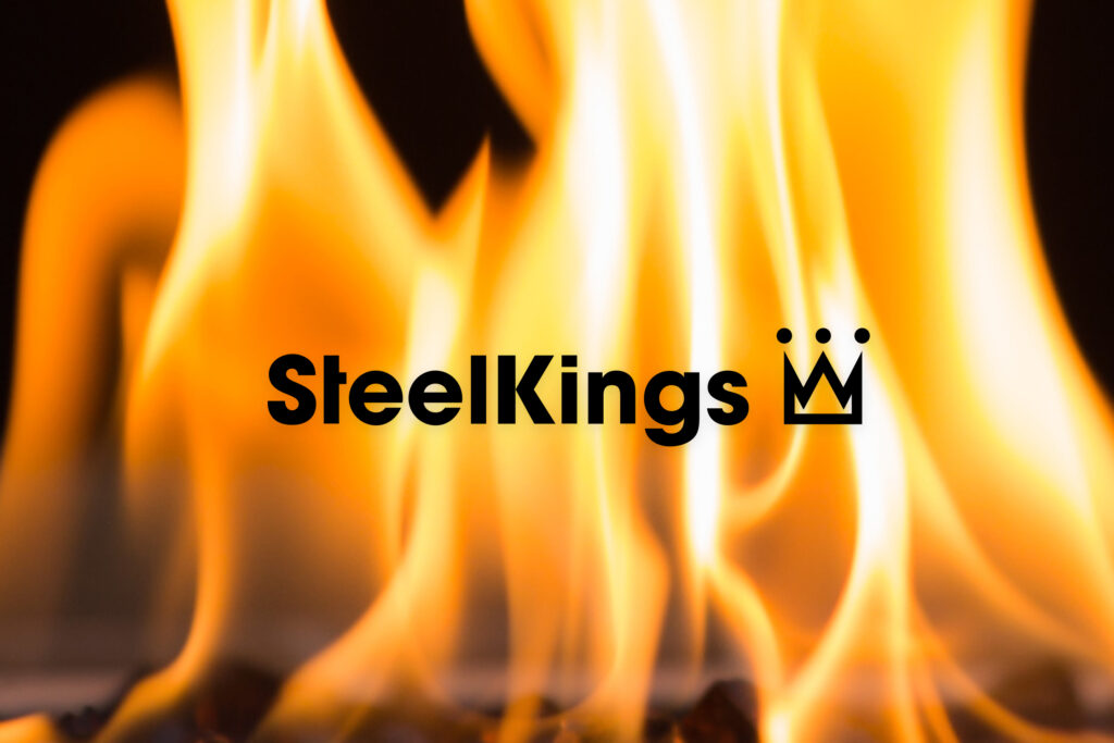
The icon and logo were designed with precision to ensure they could be laser-etched onto steel at very small sizes while maintaining clarity and detail.
You Might Also Like