Brand Elevation
Hubbub
Creating a Bold and Engaging Brand Identity for Hubbub
Client: Hubbub
Services: Branding
Background
Hubbub needed a brand identity that captured its energetic, interactive nature while standing out in a crowded market. Verso developed a fun, dynamic, and comprehensive visual system that reflects the brand’s core mission—seamless and vibrant communication.
Approach
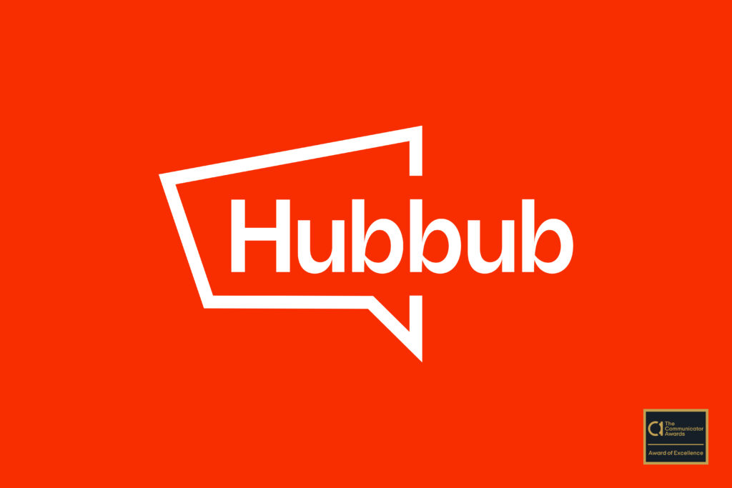
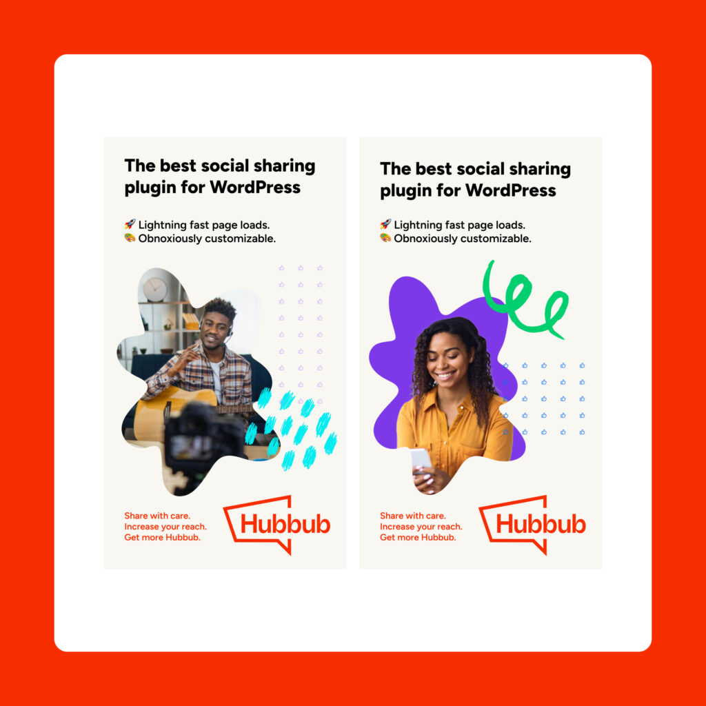
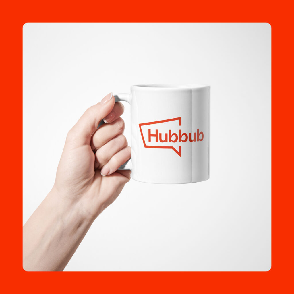
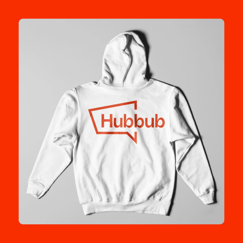
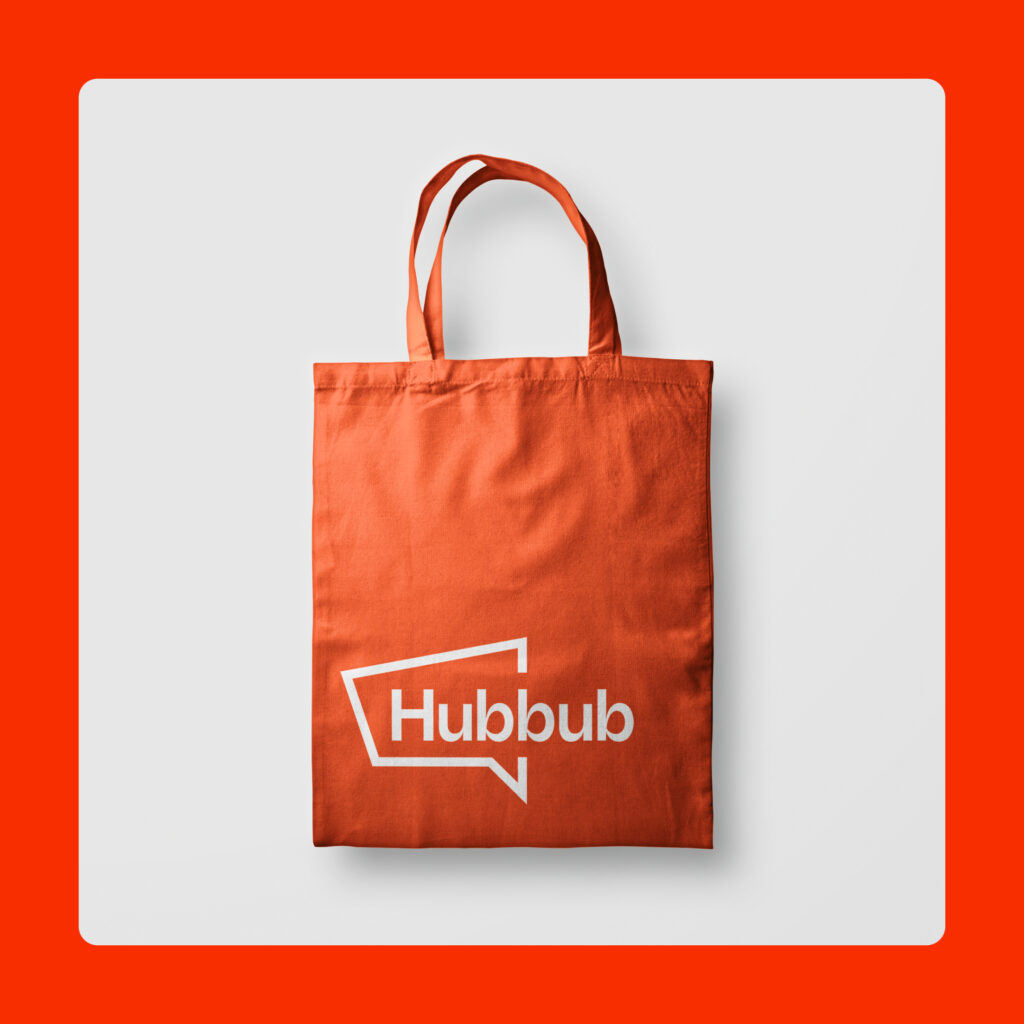
The brand identity was built around bright orange as the primary color, evoking energy and excitement. At the heart of the identity is a striking logo, which creatively blends a megaphone and chat symbol in a stylized sans-serif font, symbolizing both voice and interaction.
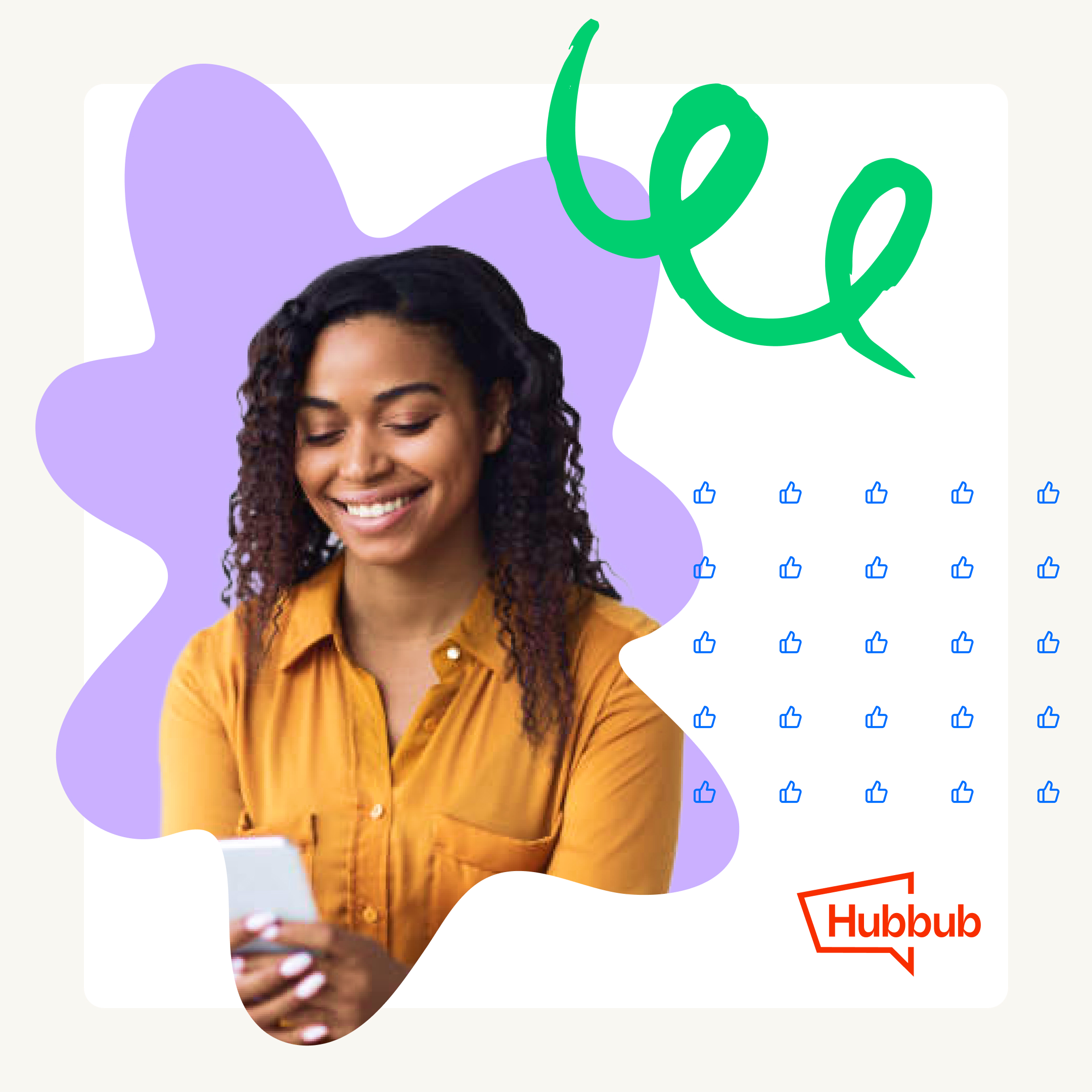
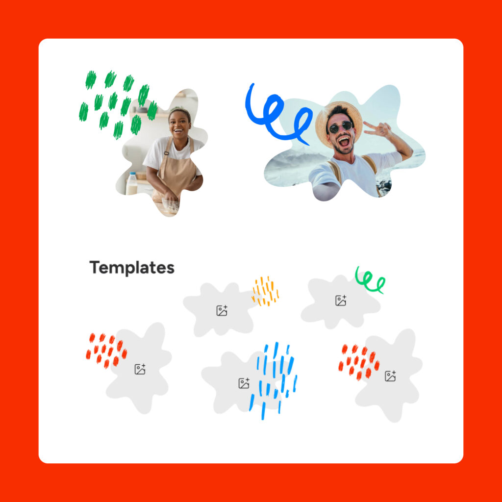
To reinforce the brand’s dynamism, imagery is masked within fluid, energetic shapes, creating a sense of movement and engagement. A whimsical graphics package, featuring playful shapes and icons, adds depth to the brand storytelling, forming a Monet-esque montage that enhances visual appeal and narrative cohesion.
Results & Impact
The new identity positioned Hubbub as a bold, engaging brand that captures attention while reinforcing its mission of clear, interactive communication. The success of the brand refresh was recognized with an Award of Excellence from AVIA and the Communicator Awards, a testament to the power of thoughtful design and collaboration.
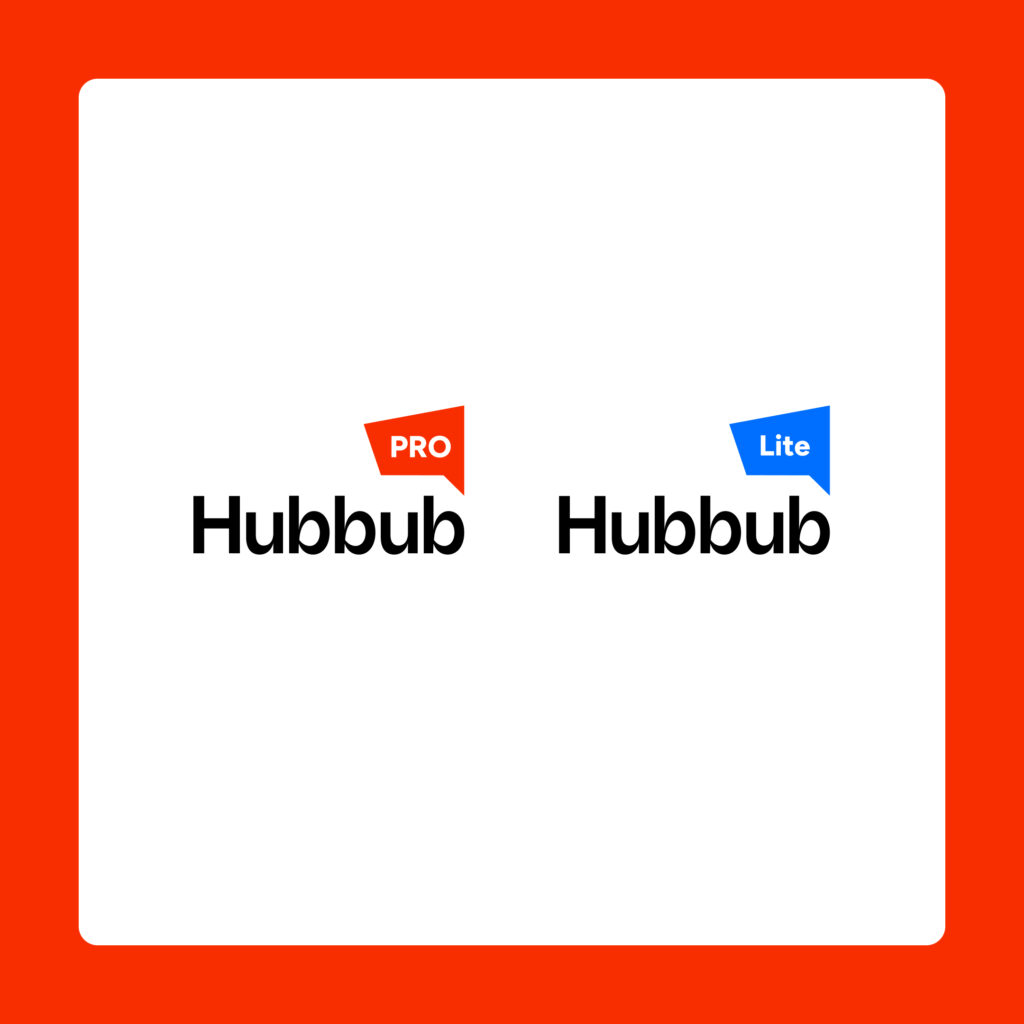
We developed a flexible icon system to differentiate product versions—Pro, Lite, and future offerings—through distinct yet cohesive visual markers. Each icon maintains a unified design language while incorporating unique elements, such as color variations and subtle stylistic changes, ensuring clarity, brand consistency, and scalability as new products are introduced.
The new icon system was designed for internal use and recruiting purposes, drawing inspiration from a playful retro technology aesthetic and the team’s musical hobbies.
You Might Also Like