Brand Elevation
Span
Revitalizing Span Digital’s Brand with a Retro-Inspired Identity
Client: Span Digital
Services: Brand
Background
Span Digital, a San Francisco-based technology consultancy, sought a refreshed visual identity that would honor its legacy while embracing a bold, contemporary presence. Verso reimagined the brand with a retro-inspired aesthetic, blending nostalgia with timeless design elements to create a distinctive and cohesive identity.
Design Conceptualization
Vintage-Inspired Typography – Bold typefaces reminiscent of classic tech industry aesthetics.
Earthy & Vibrant Color Palette – A mix of tones based on The City skyline introducing striking pops of color to balance sophistication with energy.
Versatile Logo Badge – A clean, retro-inspired mark designed for seamless integration across business cards, digital platforms, and marketing collateral.
Results & Impact
The updated identity strengthened Span Digital’s brand recognition and visual consistency across all touchpoints. The retro charm not only set the brand apart but also reinforced its expertise and credibility in the ever-evolving tech landscape.
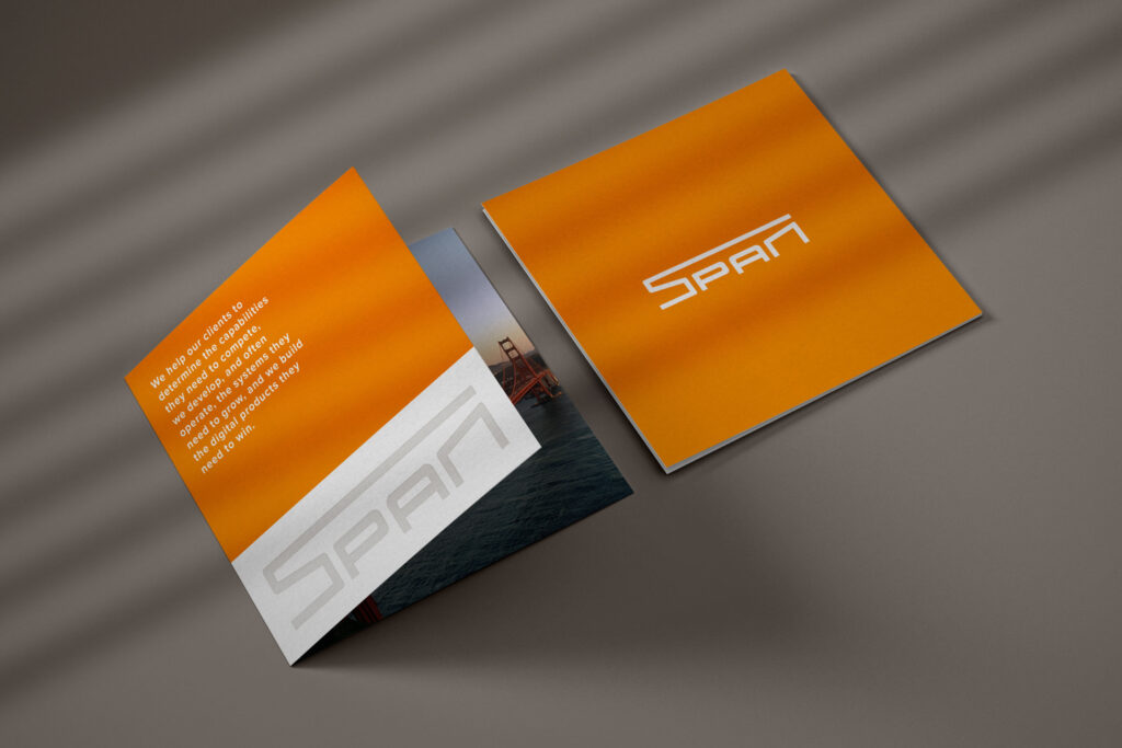

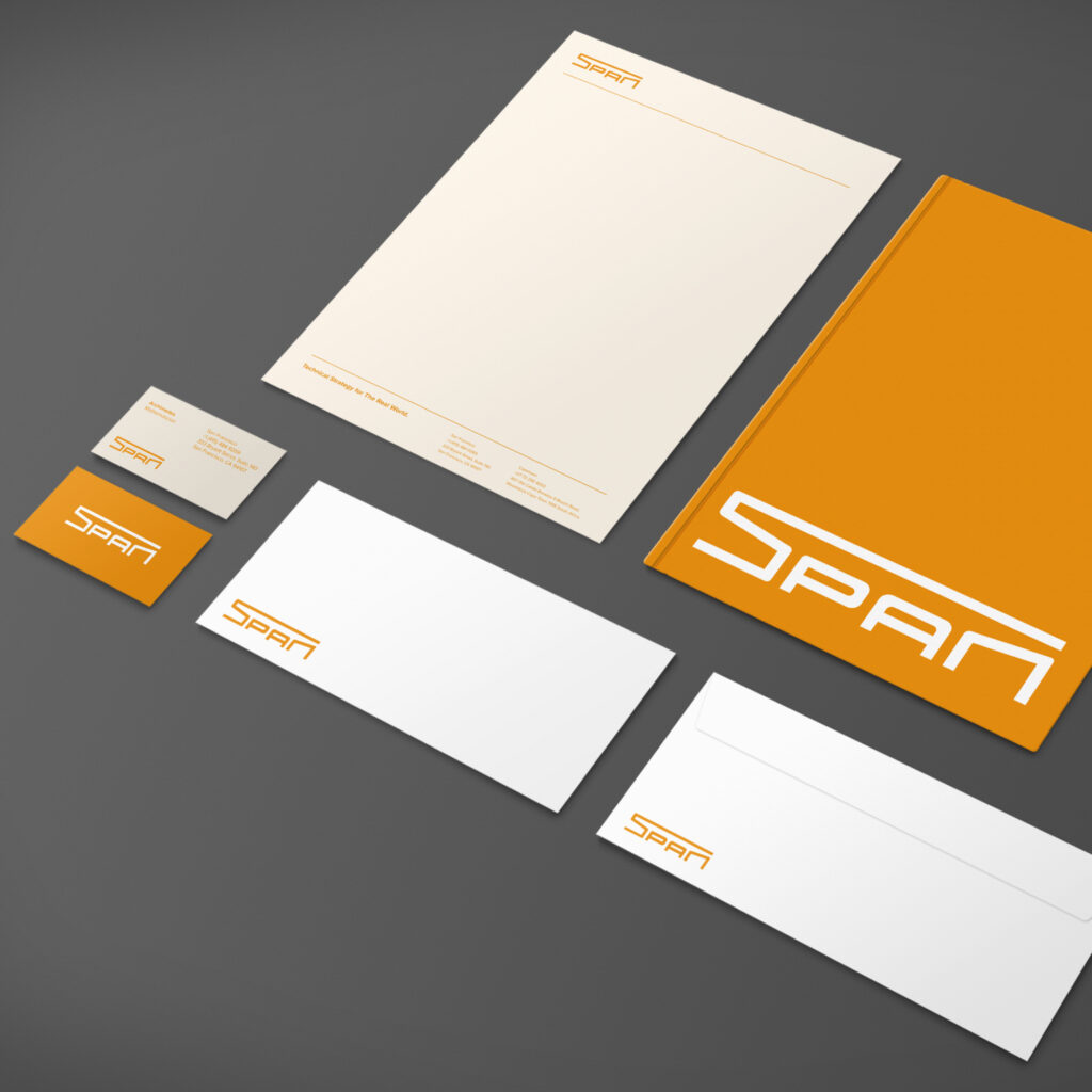
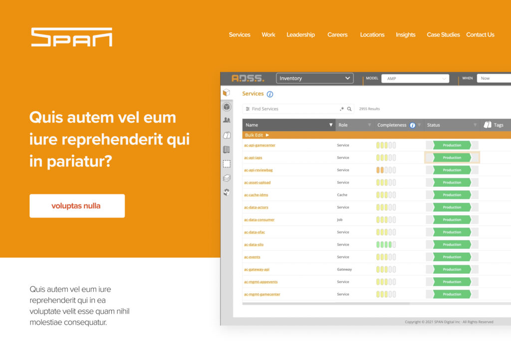
As part of the brand refresh, we developed a simplified collateral system that ensures consistency while allowing for flexibility across various touchpoints. By streamlining layouts, typography, and color applications, we created a cohesive suite of materials that maintains the brand’s retro-inspired aesthetic without feeling cluttered or overly complex.
The new system includes easy-to-use templates for business cards, presentations, and digital assets, making it simple for Span Digital’s team to apply the brand across different mediums. This approach not only enhances brand recognition but also improves efficiency in day-to-day communications..


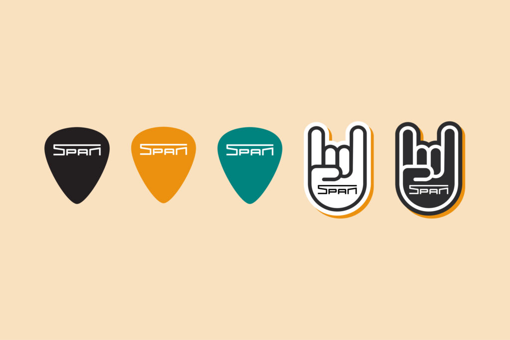
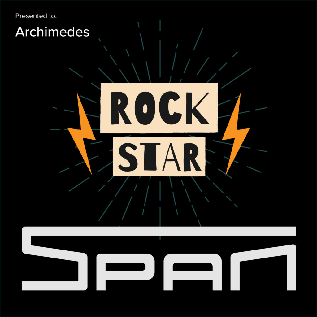
The new icon system was designed for internal use and recruiting purposes, drawing inspiration from a playful retro technology aesthetic and the team’s musical hobbies.

You Might Also Like